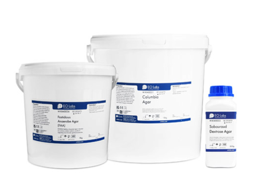
Product packaging at E&O was significantly different to the types of packaging I had created at previous employers. Whereas packaging for toy firms tends pack a visual punch, packaging at a microbiological culture media manufacturer tends to be much more understated!
The products intended use are a serious business, with very tight quality controls. Quality assurance, quality control and exceptional service really are what drives success and thus would mean daily discussions with people with serious accreditations. Everything has to be “just so”.
When I started work there, as part of my extensive induction into the company, I was exposed to all areas – the R&D and QC Labs, Production clean rooms where the filled petri-dishes and bottled media were poured, and the warehouse. Whilst in the warehouse and trying to pick orders, I was struck by how inefficiently designed the petri-dish packs were. (I need to get my hands on a picture of one of the old plate packs to show you what I mean). It was clear to me that they could use some work.
The previous design had been introduced circa 15+ years earlier (exactly when no-one knows!). My thinking was that the company produces millions of plates every year and for our end users, in some way the product packaging is the “face” of the company – it’s what represents the company before they use the product. For many end users, they are not dealing face to face with the company or even purchasing the product themselves – they are merely using a product sourced by a procurement department at one of the many NHS Trusts to carry out a specific task. But every time a pack of plates is taken from a chilled storage unit is an opportunity to communicate the brand, the products and the company, thus well designed packaging is a must.
When the company transitioned to using both stackable plates and a revolutionary compostable packaging film, I seized this as the opportunity to rework the info panel layout. With new legislation introduced requiring packaging to incorporate GTIN numbers and thus GS1 datamatrices, this wasn’t a straightforward task. Lots of iterations but ultimately we settled on a format that is significantly improved over the original packaging, with much more legibility of text and efficient use of the space available due to the printing limitations.
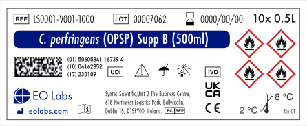
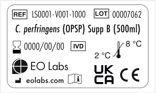
Due to the implementation of GTIN and GS1 datamatrices on all products, I also developed new labels for other products the company produces, including supplements which are freeze dried and held in very small vials where space is very limited.
DCM Labels
Just like with the petri-dishes mentioned above, labelling for Dehydrated Culture Media products hadn’t been high on the priority list. (Again I need to get a picture of one of the old labels for comparison). Early on it struck me that the company’s product labels were just functional. They weren’t impressive. They almost had a “home-made” quality about them. Clearly though, the company has been successful, likely as a result of the quality of the products and maybe more importantly, the service the company provides when you become a customer.
But one day when watching a film on TV, one of the Spiderman movies, something struck me. There was a scene where Peter Parker was in his laboratory along with two other Peter Parkers (it was a multidimensional storyline!), and on the gantry in the lab there were a myriad of bottles and vials. But clearly I could see bottles from Fischer Scientific. They stood out like a sore thumb with their impactful design, especially the large “F” logo device. As a designer, this made me question why weren’t we doing similar. The “F” device is very loud and proud on their lables – it resonated with me how they managed to have their brand so obvious, but still maintaining the clean styling you’d expect from products in this industry sector. Oxoid, a competitor in the same culture media sector are known for their obvious red lozenge shaped logo, and as they are so established everyone in the industry knows who they are. Their products are a ubiquitous in the trade, and so well established that their red logo is already burned into the brains of most microbiologists in the UK. I was determined to add more much needed character into our packaging, even in just a small way. That nature of the decision makers at the company are such that understatement always tends to be the way – but my design at least added a splash of signature colour and design flare.
To complicate matters somewhat, the same label is used on 3 different containers, therefore it needed to work across the board. And then GTIN came along mid-development, and the label had to be adapted to incorporate the GS1 datamatrix. As you can see, there’s a fair amount of information included in the label, so this was no small task – all data points being pulled from a database to generate the label. The label needed to cover a large number of products with wildly varying lengths of product title, and descriptive copy and potentially hazard warnings. And of course needed to be future proof to the best of our ability. As you might have guessed from the admittedly low resolution image below, I developed a new label for the DCM products. It looks pretty good to me!
Liquid Supplement Labels
Again, due to the need to incorporate GTIN / GS1 datamatrices, other products such as the Liquid Supplement range also required new labelling. All data to populate the labels would be pulled from a database, and product title length could vary wildly, as well as the symbols used to convey health hazards etc. The vials themselves can be quite small (1.75″ tall approx), thus the vial label (the one colour black label at the bottom) needed to be very efficient in terms of how information was displayed. These labels again, were a huge leap forward in terms of approach compared with the earlier iterations which were merely functional in nature.
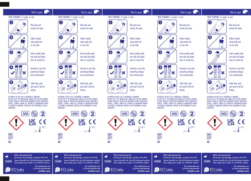
Universal Swab Kit Backing Paper / COVID19
Just like the above projects, I endeavoured to introduce a bit more style to this particular packaging format. Prior to the COVID19 pandemic, the company were mainly known for their production of pre-filled petri-dishes, animal blood products and bottled media. But when COVID hit, to their credit, they pivoted to aid in the navigation of the pandemic. Overnight, sales of the bread and butter plates and bottled media dried up, as hardly anyone was going to the hospital, fearful of contracting the dreaded COVID. But what was needed was Viral Transport tubes. Ie tubes containing a virus deactivating reagent to transport the sample swabs taken when someone was being tested for COVID using PCR technology. I’m not talking about the lateral flow tests which came along further into the pandemic. Early in the pandemic, the PCR technology involved was not well established, and it was expensive. PCR machines had been around for a while, but the infrastructure and consumables required for mass testing which took place early in the pandemic was all very new. However, something which did appear to become established reasonably quickly was the packaging format for Transport Tubes. They invariably came in a pack comprising a transport with swab capture cap and a sterile swab, blister sealed together using a thermoformer. On the rear side of the pack would be the instructions on how to use the contents so that relatively unskilled people would be able to use the kit safely. And this is where I come in.
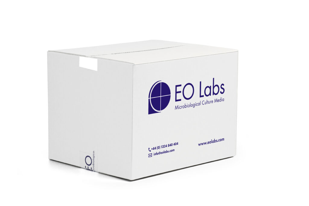
Companies invested in equipment to traverse the pandemic and produce products such as the transport tubes, but as COVID died down, E&O developed other products to utilise the new packaging format that the thermoforming machine could provide. Initially, COVID related products were produced, but then other reagents followed. However, to keep costs down, E&O decided to produce a backing paper for these packs which could be used with multiple reagents – not just COVID related ones. All illustrations are mine, and all the swab kits would come shipped in the box below – and you might have spotted the continued use of the signature E&O Blue colouring tying some of the brand style together with products further up this post. The flyer at the bottom here shows the blister formed pack as used in the Group B Strep Swab Kit, one of the many products which utilised the thermoformers following the pandemic.