2bTanned are looking to refresh two of their existing packaging formats: a multifunction box and their tan accelerator creams.
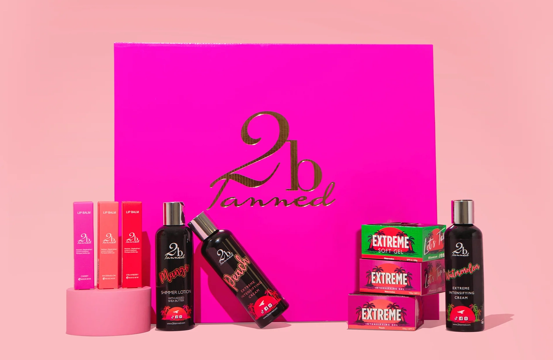
To get a feel for the brand and the existing range, I pulled together a selection of their products from their website and from other sources such as online retailers.

Tan Accelerator Creams
From an initial conversation with Ricardo Rossi, the boss at 2bTanned, he said that the Intensifying Creams were the first products developed by the company – and he was the designer of the bottles! He also showed me subsequent products introduced to the 2bTanned stable with the SPF range and Diamond Booster being the most recent additions.
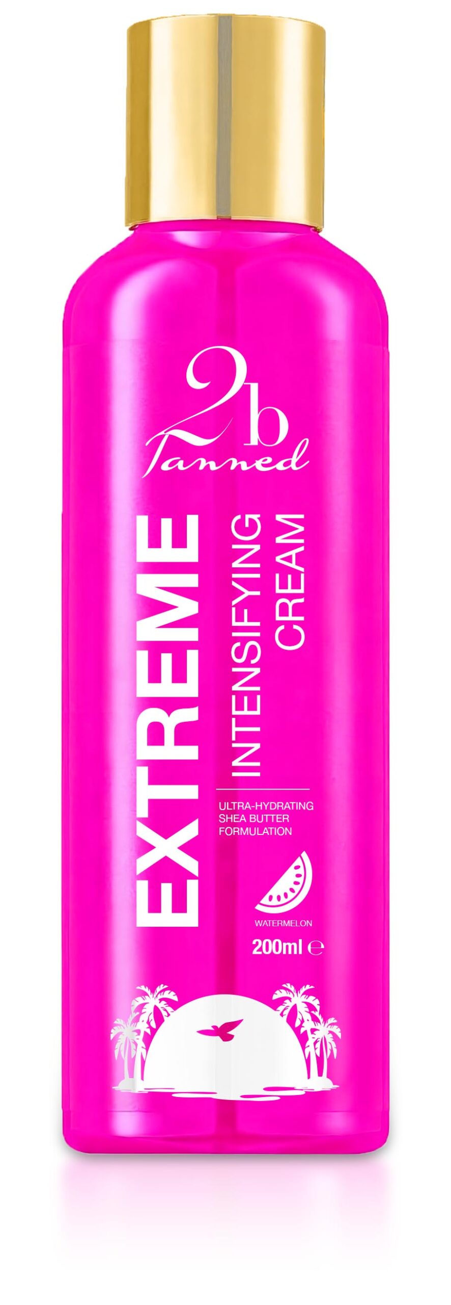
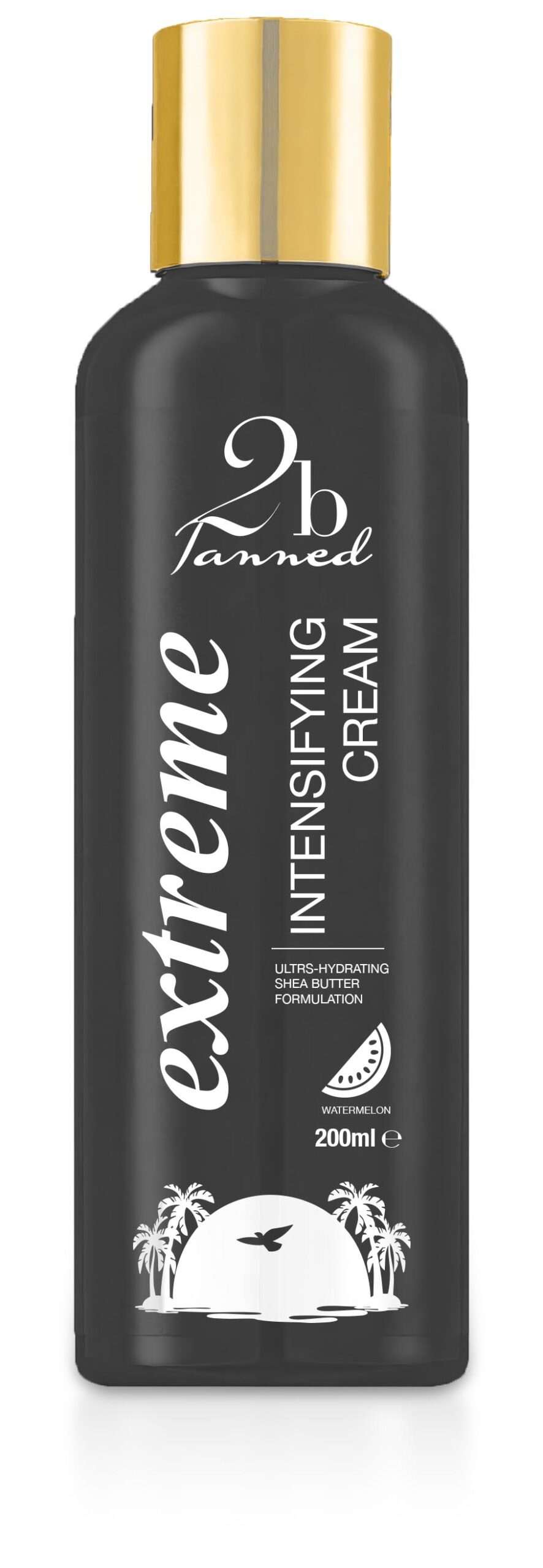
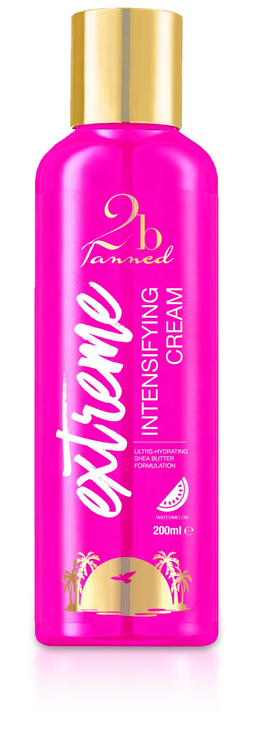
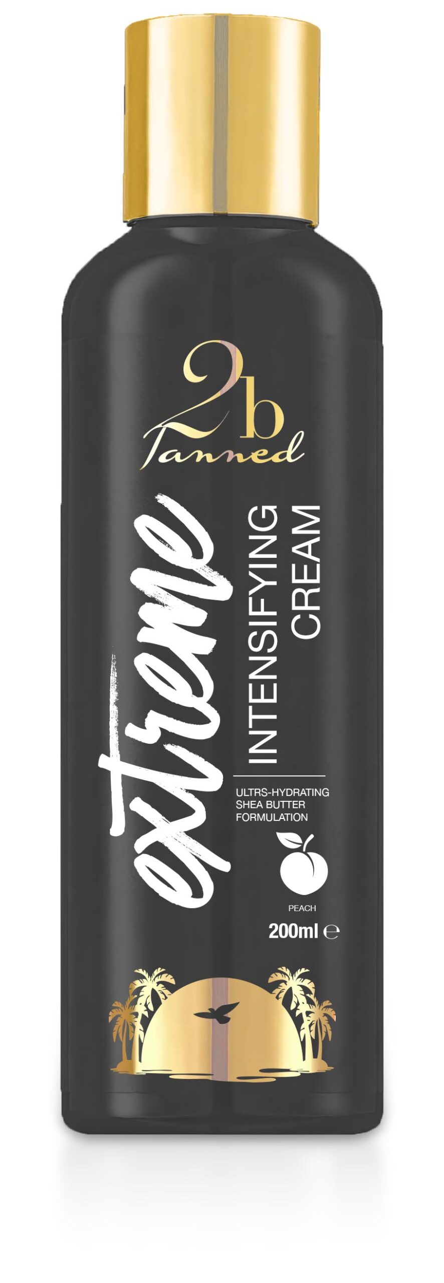
To my eyes, there’s a definite progression in style, but with some constants – notably the 2bTanned logo being consistently used across all products, more often than not centred near the top of the containers. On larger containers, the Palm Tree Sunset device is also used near the bottom of the printable area of containers. On smaller products though, this device is either not used – probably due to size constraints and legibility issues at a small print size, though maybe the device has been dropped from the style guide? Regardless, I decided to try a few ideas out – initially keeping the Palm Tree Sunset device for continuity, and a nod to the original design of this particular product.
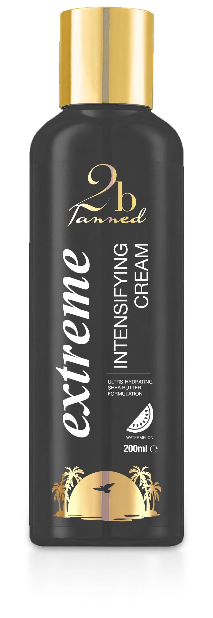
First things first – I needed to get a high quality visual blank product from which to work with – which I composed from images of the product online, and with a bit of jiggery pokery via Nanobanana and DeepAI’s image editor I had a nice blank to start from.
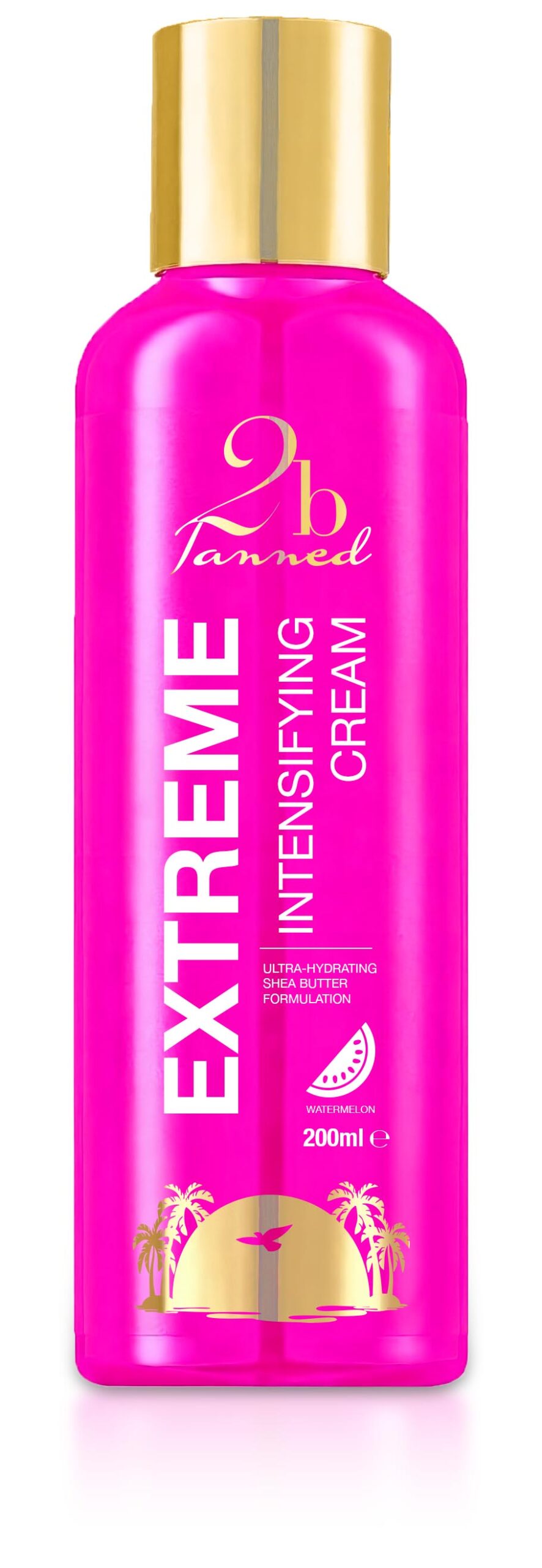
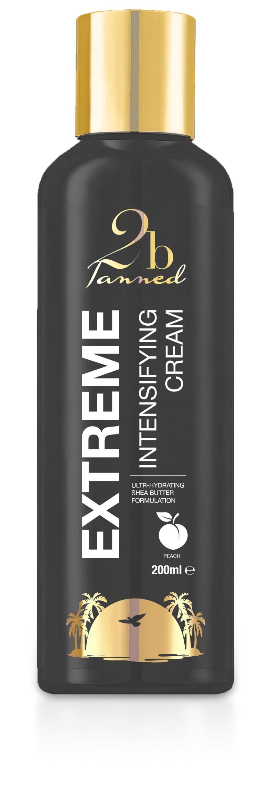
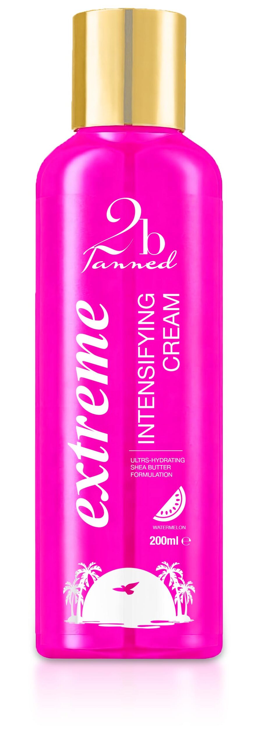
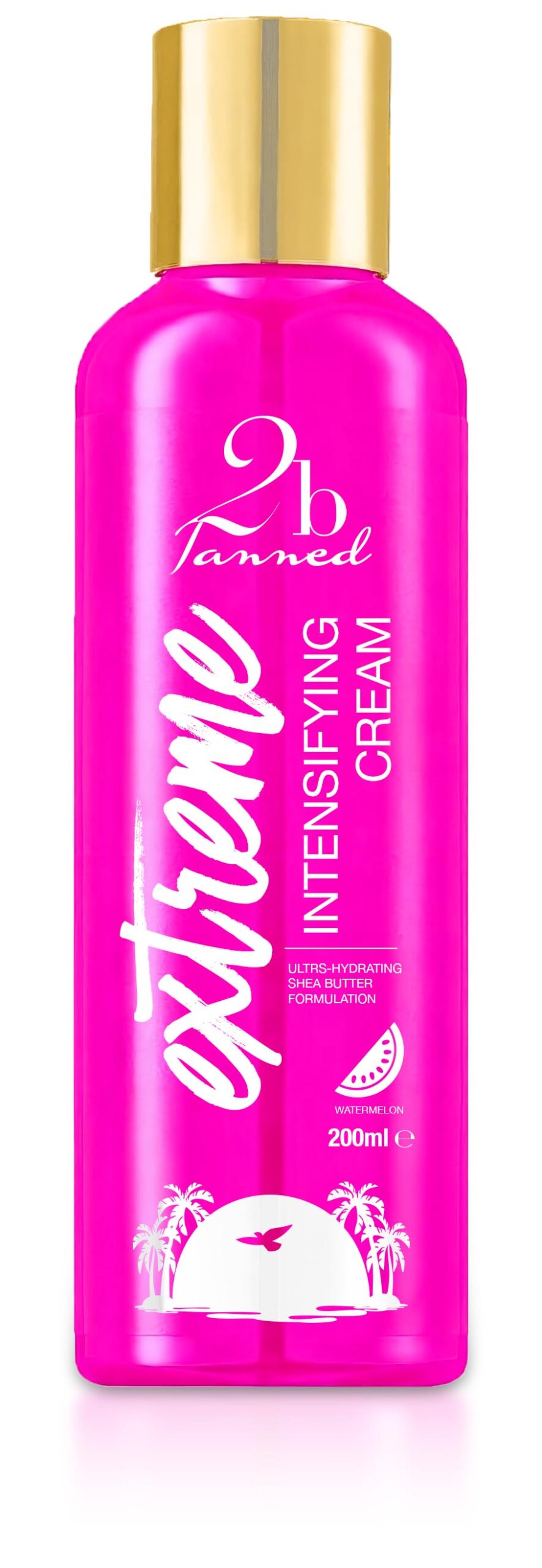
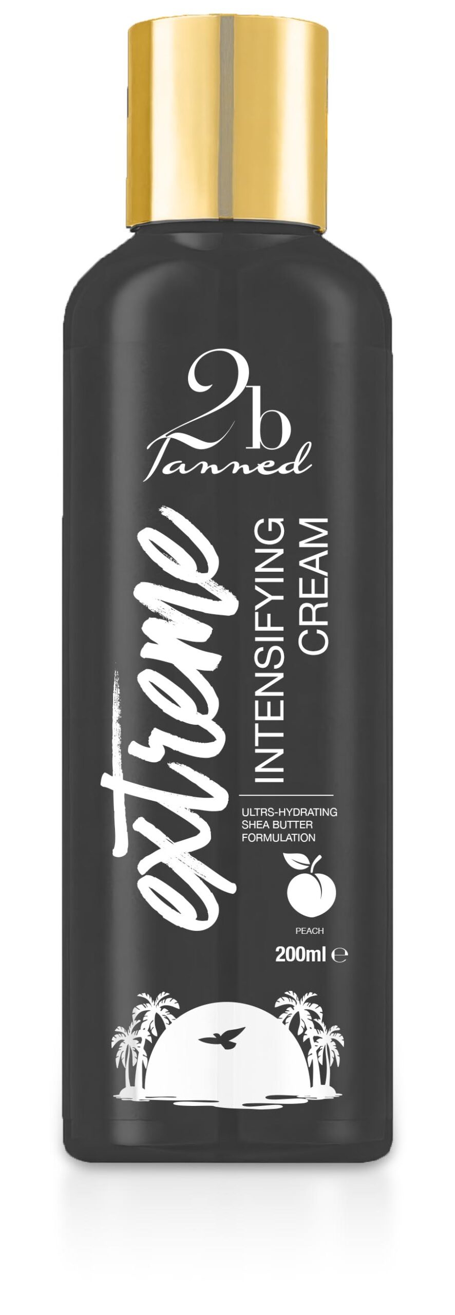
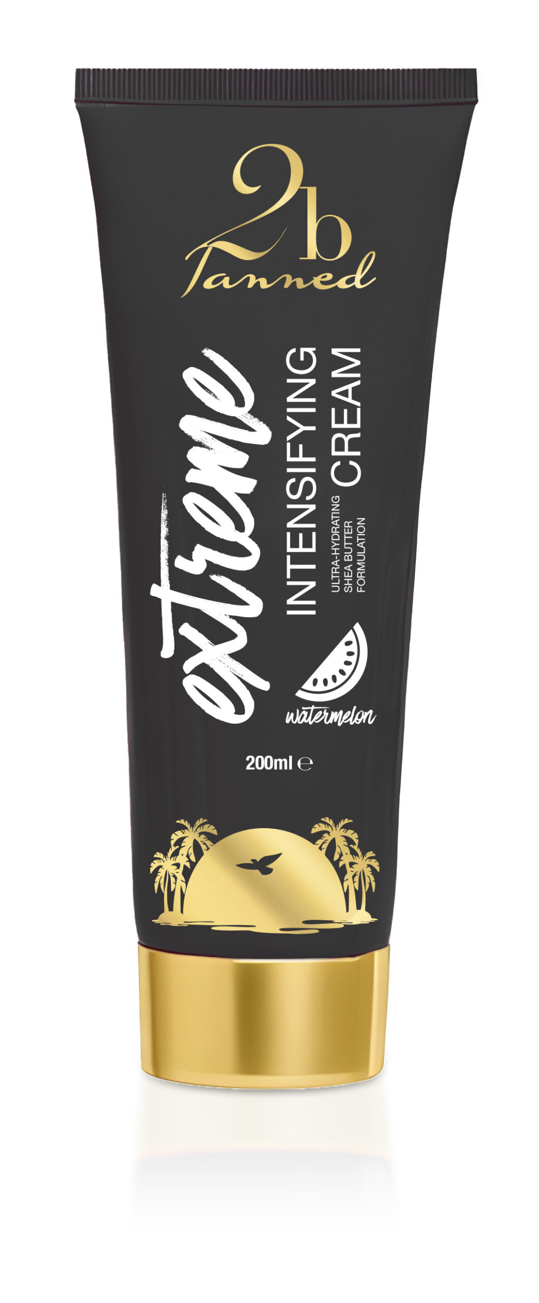
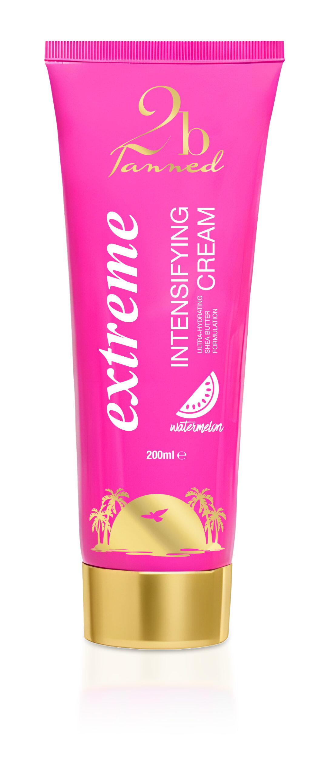
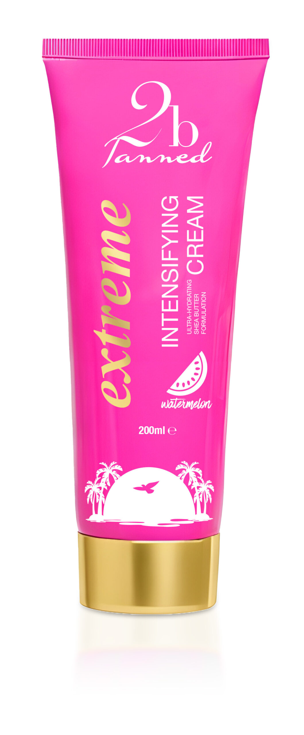
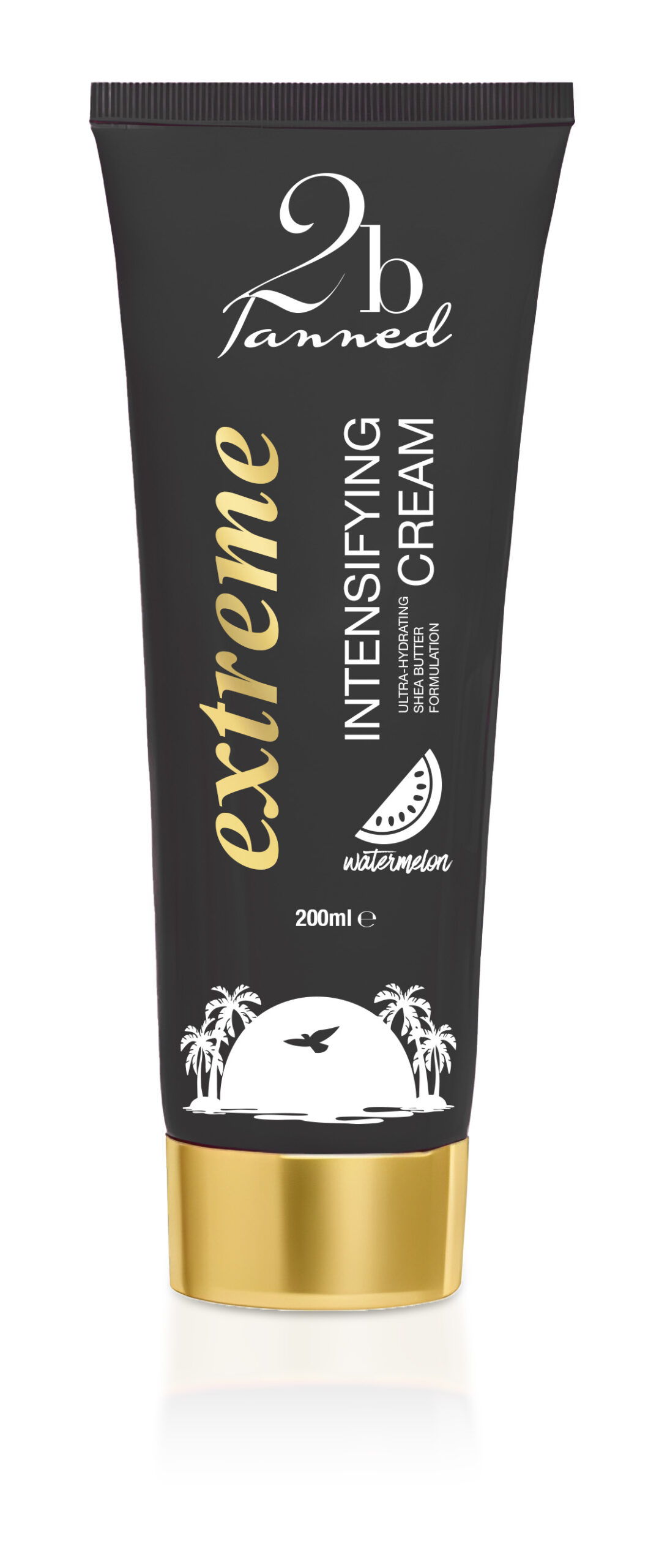
Given that the existing range using this format are in black, I began there, but also figured that a pink variant would be useful, and maybe more in keeping with the rest of the 2bTanned signature style, which tends to lean heavily on pink.
As you can see I also chose to use a gold cap – gold as an accent colour is commonly used on 2bTanned products.
I initially opted for a similar kind of layout to the Extreme Tingle product group, given these are “Extreme Intensifying Creams”.
I personally prefer branding to be very legible on packaging, so for me, the all white print on the bottles would not only keep production costs down, but also work well in terms of legibility. That said using the gold accent colour on the 2bTanned logo and the palm tree device does add an element of “bling” which is certainly in keeping with the feel of the 2bTanned brand.
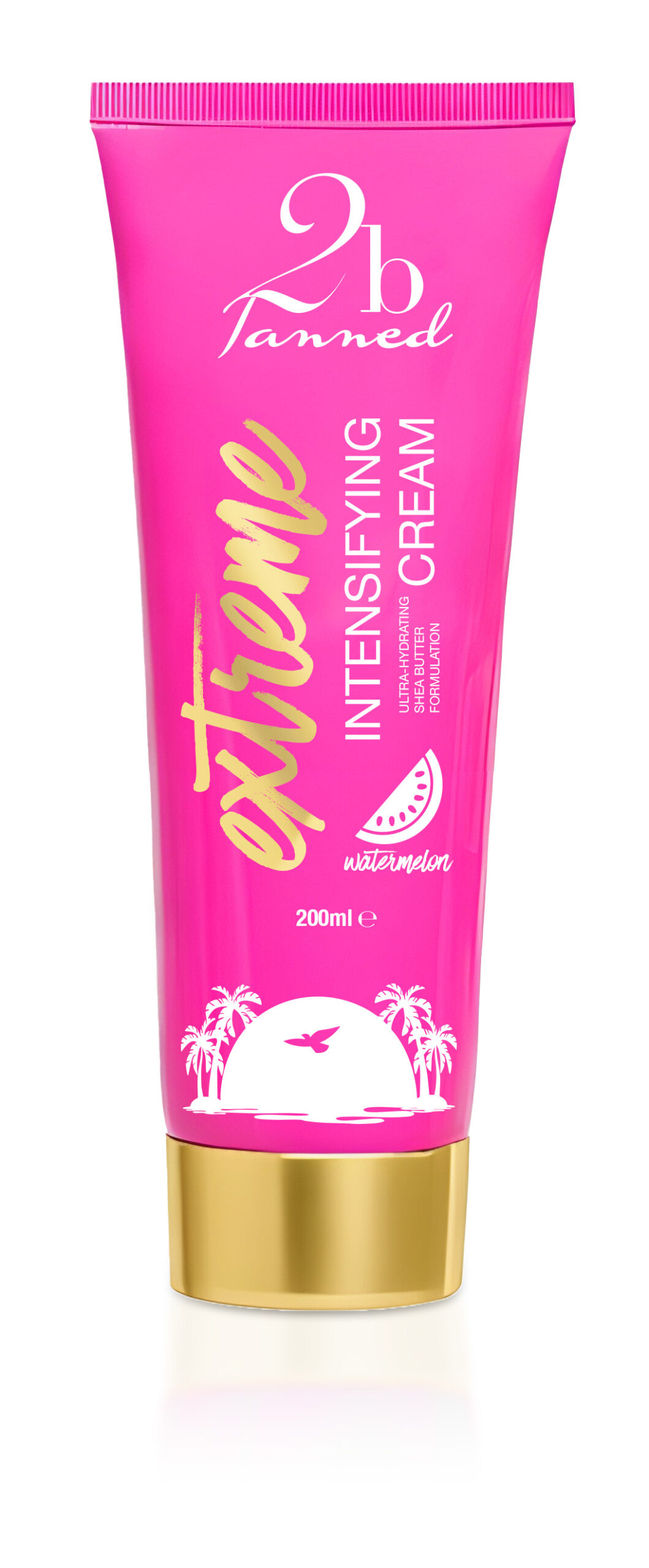
Additionally, I had the idea to convey the scents of each cream in a visual rather than purely textual way as has been done before, by introducing icons such as a Watermelon segment and a Peach. These seem to work well.
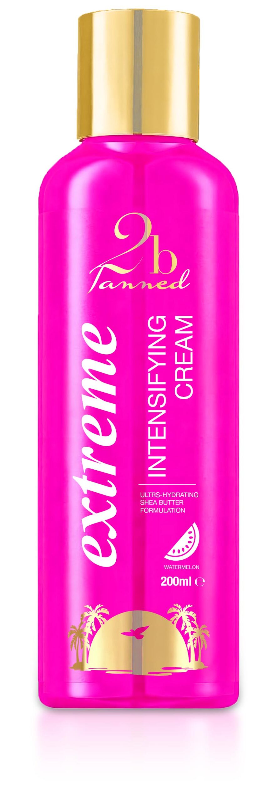
Next – I figured that an alternative typeface might be an idea to try for the main title, utilising the same typeface as used in the SPF range – times New Roman Bold Italic.
Whilst scrolling through my typeface library, I came across an energetic typeface which may work – Have Heart. The scent icons certainly work well to convey the different flavours available, but for any final version, I’d like to spend additional time on getting the icons “just so”.
And of course, these ideas could be easily applied to the tube format of other products in the range.
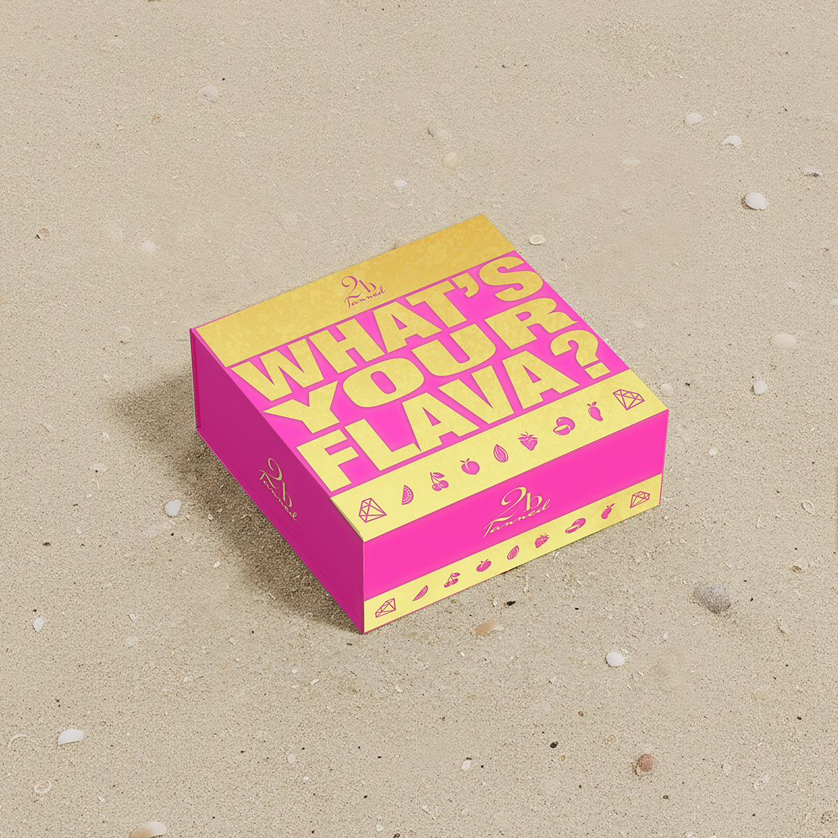
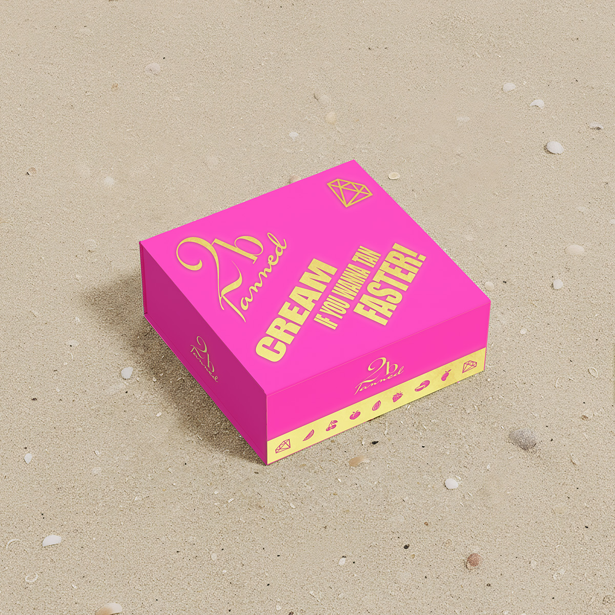
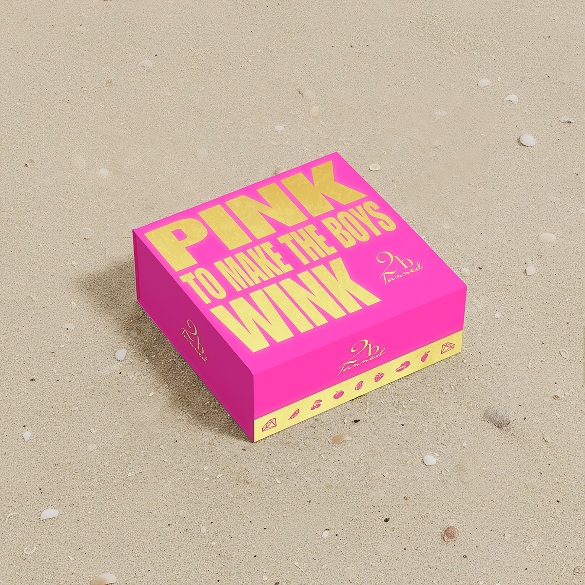
Multi-purpose Box
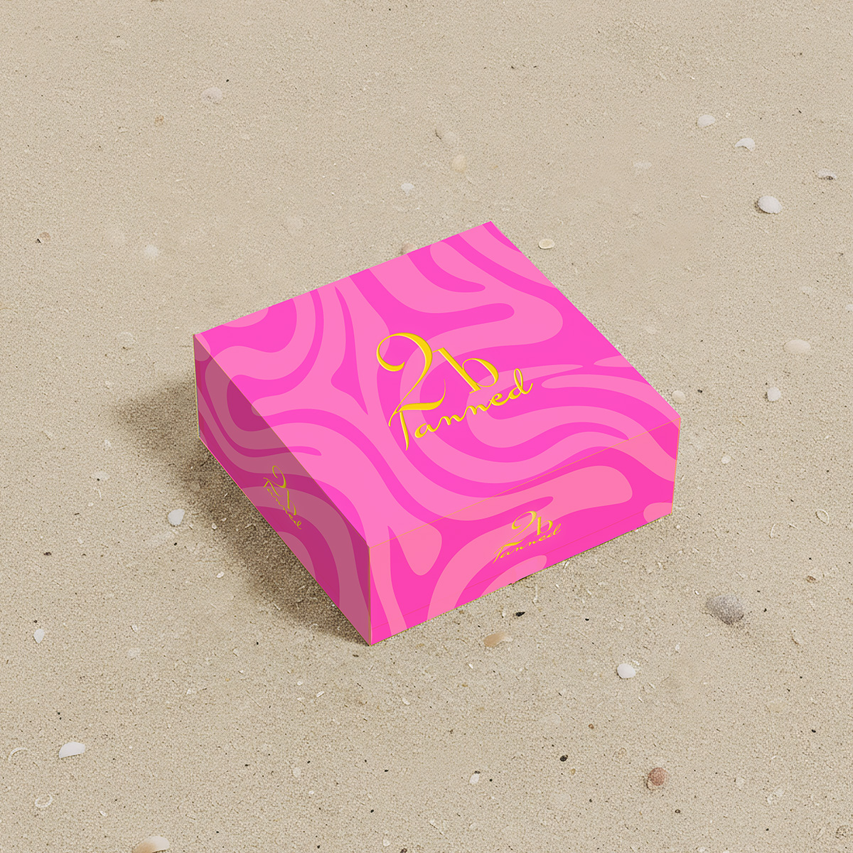
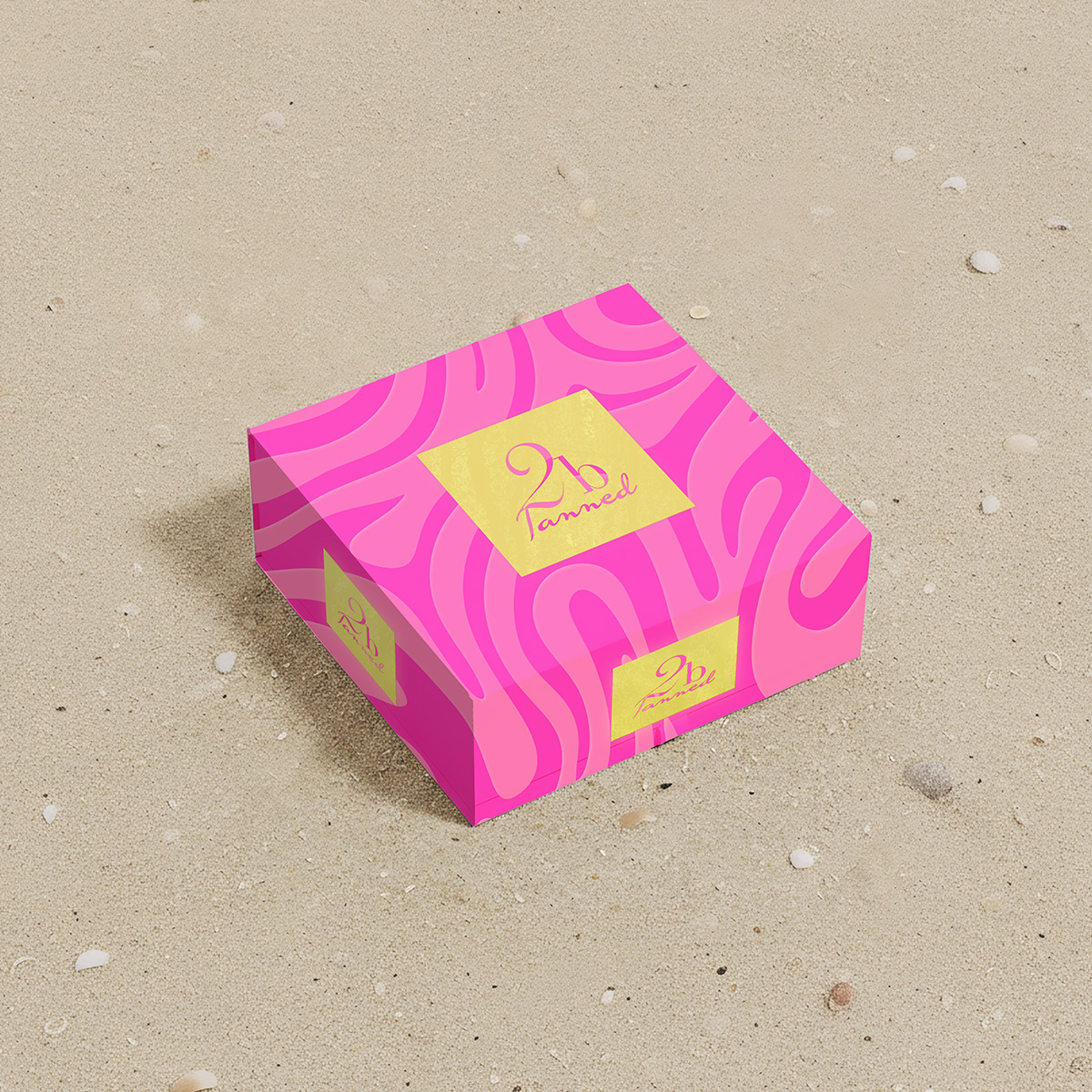
Next up – a new gift box. Below is the original box (at least I think it is!)
Again I figured I’d need a decent blank box – though opted for something which will give us a feel for the sides of the box too. And just for the heck of it, I decided to put it on a sandy beach. The original box had a fairly large 2bTanned logo centred on the top face.
Borrowing from their SPF mist and aerosols, I tried to replicate the swirly, almost camouflage background of those products and use this as an initial basis for the box. This would have the box in keeping with others in the range, whilst also offering something different. Again, I opted for gold accents. It occurred to me that with the camo pattern, the ridges in the “camo” could be embossed offering a tactile element to the box too though the visual may not quite convey this idea as well as I would like. Other variations include using the logo on a gold embossed “plate” style object.
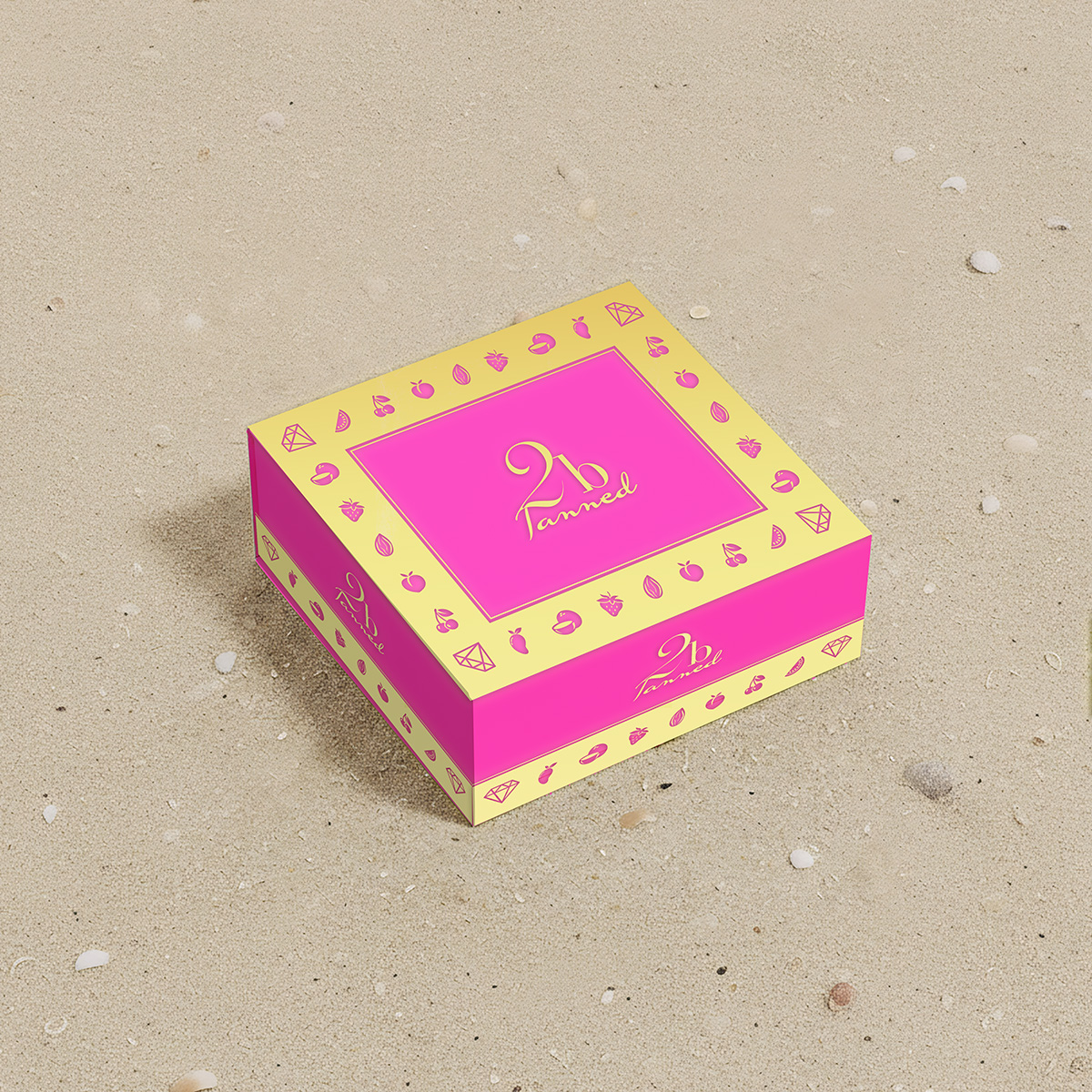
The assorted scents of the products gave me an idea. I trawled through the range, listing all of the scents 2bTanned offer and selected a corresponding icon for each. For a couple of designs I used the icons as an ornamental border round the top face and sides of the box. At the last juncture, I wondered about going heavy with playful, bold messaging, with the different scents, a play on words with a well known fairground slogan, and another “pink” related slogan acting as inspiration.